@gadgetinc/react/auto
The @gadgetinc/react/auto package powers Gadget autocomponents: beautiful auto-generated tables and forms pre-configured to read and write data using your Gadget app's auto-generated API.
The following is a comprehensive list of each autocomponent and its properties. Refer to the autocomponents guide for examples of how to use these components in your application.
The Gadget team is looking to create autocomponents from different design systems like MUI. Let the team know which design system we should add next on Discord.
<AutoTable />
The AutoTable component reads data from your database and renders each record as a row in the table. Pagination, search, and sorting are included in AutoTable components and are configurable with parameters.
Props
The AutoTable component accepts the following props:
| Name | Type | Description |
|---|---|---|
model | ModelFinder | Required. This is the data model you wish to show the records of. Ex: api.yourModelName |
select? | FieldSelection | A list of fields and subfields to select. This will override the default selection. See the Select option docs |
pageSize? | number | Page size of the paginated table. Defaults to 50 |
initialCursor? | string | A string cursor; useTable handles pagination, this prop is only needed if you want to set the cursor to a custom spot |
live? | boolean | Change the table in real time when a record is created/updated/deleted. Defaults to false |
onClick? | (row) => void | Perform a custom action when a table row is clicked |
columns? | string[] | CellDetailColumn[] | CustomCellColumn[] | Columns to include in the table. Fields are passed as an array of strings by API identifiers. For relationships, you can choose which field of the related model to render using dot notation such as shopifyProduct.sku. HasMany relationships require a fully qualified GraphQL path, such as shopifyProduct.edges.node.sku. You can also pass a detailed column with a custom header, in this form: { header: string, field: string }, or a custom cell column: { header: string, render: (GadgetRecord<any>) => React.ReactNode, sortByField?: string }. The sortByField property is the API identifier of the field to use for sorting when a custom cell column is clicked for sorting |
excludeColumns? | string[] | A list of API identifiers for columns to exclude from the table |
initialSort? | { [key: string]: "Ascending" | "Descending" } | See the Sorting section in your application's API documentation for more info |
filter? | FilterObject | Filters to limit the set of returned records. Optional. See the Model Filtering section in your application's API documentation to see the available filters for your models |
actions? | (string | ActionCallback)[] | List of actions that AutoTable can execute on the records it renders. This prop is a list of action API identifiers in string form or action callback objects which can have custom labels, be promoted buttons, or run a JavaScript function, where the ActionCallback type is in the form: {label: string, promoted?: true, action: string | ((records: GadgetRecord<any>[]) => any)} |
excludeActions? | string[] | Actions to exclude from the AutoTable |
selectable? | boolean | Toggle whether rows are selectable. Defaults to true |
emptyState? | React.ReactNode | What to render when there are no records to populate the table |
loadingSkeleton? | React.ReactNode | Placeholder skeleton to display when the table is loading |
resourceName? | { singular: string; plural: string } | The name of the resource that is populating the table. For example, if each row corresponds to a customer, resourceName would be { singular: "customer"; plural: "customers" } |
searchable? | boolean | Toggle whether the search bar is visible. Defaults to true |
searchValue? | string | Optional search value to programmatically search for the model records |
Props passed to the components in different design systems:
- Polaris (React): IndexTable
- Polaris (Web components): N/A
- Shadcn: N/A
<AutoForm />
<AutoForm /> renders a form that calls one of your app's backend API actions. You can use <AutoForm /> for model actions to create, update, or delete records. Global actions can also be called from <AutoForm />.
Props
| Name | Type | Description |
|---|---|---|
action | ActionFunc | Required. Which action this form will run on submit |
title | string | false | A custom form title, replacing the auto-generated title. Use false to hide the title |
findBy? | string | { [key: string]: any } | Details for automatically finding a record to seed the form values. When passed as a string, will look up a record with that id. When passed an object, will call a findBy<Field> function on the api object to retrieve a record by that field. The field must have a uniqueness validation to function. |
record? | GadgetRecord<any> | A record for this form to act on |
include? | string[] | An allowlist of fields to render within the form. Only these fields will be rendered as inputs |
exclude? | string[] | A denylist of fields to render within the form. Every field except these fields will be rendered as inputs |
defaultValues? | DefaultValues | A set of field values to pre-populate the form with on load. Only applies to create action forms. Must pass in fully-qualified path including the model name, for example: defaultValues={ { widget: { name: "foobar" } } } |
submitLabel? | React.ReactNode | The label to use for the submit button at the bottom of the form |
successContent? | React.ReactNode | What to show the user once the form has been submitted successfully |
loadingSkeleton? | React.ReactNode | Placeholder skeleton to display when the form is loading |
onSuccess? | (record) => void | Called when the form submission completes successfully on the backend |
onFailure? | (error) => void | Called when the form submission errors before sending, during the API call, or if the API call returns an error |
select? | FieldSelection | Override control for selecting existing records with findBy. This is useful to prevent refetching when the form contains conditionally rendered inputs components |
The AutoForm can be customized by adding children. Here's an example with the Polaris design system:
Adding custom children to an <AutoForm /> disables the title and submitLabel props and requires you to manually include the <AutoSubmit /> and <SubmitResultBanner /> components.
Custom selection and conditionally rendered inputs
If you have an update action in an <AutoForm /> with custom child components, you may encounter a refetch for the existing record when the inputs appear conditionally. Consider a situation like this where you have a button that controls the appearance of some AutoInput components.
A refetch will occur when the AutoInput components with inventoryCount and owner get rendered for the first time. To prevent this refetch, you can use the select prop in <AutoForm /> to override the default selection behavior to include all field inputs that can be potentially rendered in the form.
<AutoInput />
This input detects the type of the field, and renders the correct input type. If the field is of type date / time, the AutoInput will return a date/time picker.
| Name | Type | Description |
|---|---|---|
field | string | Required. API identifier of the field you wish to render. |
label? | ReactNode | Custom label for the input. |
If you wish to customize the AutoInput further, use the input that corresponds to the type of the field.
<AutoHiddenInput />
The hidden input allows you to add to the form submission without rendering an input. An example would be including user preferences in a hidden input. When a user submits the form, their preferences are included in the form submission without any extra input from them.
| Name | Type | Description |
|---|---|---|
field | string | Required. API identifier of the field you wish to render as a file input. |
value? | any | Value of the hidden input. Users cannot change this directly. |
<AutoBooleanInput />
| Name | Type | Description |
|---|---|---|
field | string | Required. API identifier of the field you wish to render as a checkbox. The field must be of type boolean. |
label? | ReactNode | Custom label for the input. |
control? | Control<any> | Control object from the React Hook Form library. |
Props passed to the components by different design systems:
<AutoDateTimePicker />
| Name | Type | Description |
|---|---|---|
field | string | Required. API identifier of the field you wish to render as a date/time picker. The field must be of type date / time. |
label? | ReactNode | Custom label for the input. |
error? | string | Error message to display. |
hideTimePopover? | boolean | Hide the popover that shows the currently selected time. Defaults to false. |
datePickerProps? | DatePickerProps | Full props list can be found in the Polaris Date Picker docs. |
timePickerProps? | TimePickerProps | The time picker takes the same props as a Polaris text field. |
Props passed to the components by different design systems:
- Polaris (React): Date picker
- Polaris (Web components): N/A
- Shadcn: Calendar
<AutoEncryptedStringInput />
A component that allows users to enter strings which they want to encrypt.
| Name | Type | Description |
|---|---|---|
field | string | Required. API identifier of the field you wish to render as an input. The field must be of type encrypted string. |
label? | ReactNode | Custom label for the input. |
control? | Control<any> | Control object from the React Hook Form library. |
Props passed to the components by different design systems:
- Polaris (React): TextField
- Polaris (Web components): PasswordField
- Shadcn: Input
<AutoEnumInput />
A component that allows the user to select one or more options.
| Name | Type | Description |
|---|---|---|
field | string | Required. API identifier of the field you wish to render as an input. The field must be of type enum. |
label? | ReactNode | Custom label for the input. |
placeholder? | string | Optional placeholder for the input. |
control? | Control<any> | Control object from the React Hook Form library. |
Props passed to the components by different design systems:
- Polaris (React): ComboBox
- Polaris (Web components): N/A
- Shadcn: N/A
<AutoFileInput />
A file input box.
| Name | Type | Description |
|---|---|---|
field | string | Required. API identifier of the field you wish to render as a file input. The field must be of type file. |
label? | ReactNode | Custom label for the input. |
control? | Control<any> | Control object from the React Hook Form library. |
Props passed to the components by different design systems:
<AutoJSONInput />
An input with built-in JSON validation.
| Name | Type | Description |
|---|---|---|
field | string | Required. API identifier of the field you wish to render as a JSON input. The field must be of type json. |
label? | ReactNode | Custom label for the input. |
control? | Control<any> | Control object from the React Hook Form library. |
Props passed to the components by different design systems:
<AutoNumberInput />
A text field, with number validations.
| Name | Type | Description |
|---|---|---|
field | string | Required. API identifier of the field you wish to render as a number input. The field must be of type number. |
label? | ReactNode | Custom label for the input. |
control? | Control<any> | Control object from the React Hook Form library. |
Props passed to the components by different design systems:
- Polaris (React): TextField
- Polaris (Web components): NumberField
- Shadcn: Input
<AutoPasswordInput />
A text field, with special validations for passwords. Upon submission, inputs are encrypted and stored in a shared Postgres database hosted by Gadget.
| Name | Type | Description |
|---|---|---|
field | string | Required. API identifier of the field you wish to render as a password input. Each character will be rendered as a dot by default. The field must be of type password. |
label? | ReactNode | Custom label for the input. |
control? | Control<any> | Control object from the React Hook Form library. |
Props passed to the components by different design systems:
- Polaris (React): TextField
- Polaris (Web components): PasswordField
- Shadcn: Input
<AutoRolesInput />
A Gadget app has one global list of roles that governs permissions across the application. This input allows users to select the roles that have been defined. Learn more about roles and access control here.
| Name | Type | Description |
|---|---|---|
field | string | Required. API identifier of the field you wish to render as a combobox. The field must be of type role list. |
label? | ReactNode | Custom label for the input. |
placeholder? | string | Optional placeholder for the input. |
control? | Control<any> | Control object from the React Hook Form library. |
Props passed to the components by different design systems:
<AutoEmailInput />
A text field that has validations so it only accepts strings that have a valid email format.
| Name | Type | Description |
|---|---|---|
field | string | Required. API identifier of the field you wish to render as a text input. The field must be of type email. |
label? | ReactNode | Custom label for the input. |
control? | Control<any> | Control object from the React Hook Form library. |
Props passed to the components by different design systems:
<AutoStringInput />
A text field that accepts any string.
| Name | Type | Description |
|---|---|---|
field | string | Required. API identifier of the field you wish to render as a text input. The field must be of type string. |
label? | ReactNode | Custom label for the input. |
control? | Control<any> | Control object from the React Hook Form library. |
Props passed to the components by different design systems:
<AutoUrlInput />
A text input with builtin validation for URLs.
| Name | Type | Description |
|---|---|---|
field | string | Required. API identifier of the field you wish to render as a text input. The field must be of type url. |
label? | ReactNode | Custom label for the input. |
control? | Control<any> | Control object from the React Hook Form library. |
Props passed to the components by different design systems:
<AutoRichTextInput />
A text input for rich text fields, powered by MDXEditor.
NOTE: The "@mdxeditor/editor": "^3.8.0", dependency must be in your project's package.json file to use this component.
| Name | Type | Description |
|---|---|---|
field | string | Required. API identifier of the field you wish to render as a text input. The field must be of type rich text. |
label? | ReactNode | Custom label for the input. |
control? | Control<any> | Control object from the React Hook Form library. |
There are currently no props passed to the MDX editor by different design systems.
<AutoButton />
<AutoButton /> renders a button that calls one of your app's backend API actions onClick. You can use <AutoButton /> for model actions to create, update, or delete records, or to call a global action.
| Name | Type | Description |
|---|---|---|
action | ActionFunc | Required. Which action will run when the form is submitted. |
variables? | any | The variables to pass to the action when run. See the <AutoButton /> guide for examples on how to pass in variables. |
onSuccess? | (result) => void | Callback function to run when the button succeeded at running the action. Overrides the default behavior of rendering a message to the user to display success. |
onError? | (result) => void | Callback function to run when the button failed at running the action with an error. Overrides the default behavior of rendering a message to the user to display the error. |
Props passed to the components by different design systems:
<AutoSubmit />
Submits the AutoForm onClick.
| Name | Type | Description |
|---|---|---|
children? | React.ReactNode | Children can be passed to <AutoSubmit /> to customize its label. |
isSubmitting? | boolean | Loading state of the submit button. The button will render a spinner while isSubmitting is true. |
Props passed to the components by different design systems:
<SubmitResultBanner />
The customizable banner users see when they submit your AutoForm.
| Name | Type | Description |
|---|---|---|
successfulBannerProps? | Polaris.BannerProps | What banner to render when the form is submitted successfully. |
errorBannerProps? | Polaris.BannerProps | What banner to render when the form is submitted unsuccessfully. |
Props passed to the components by different design systems:
- Polaris (React): Banner
- Polaris (Web components): N/A
- Shadcn:
The props list for Polaris.BannerProps can be found here.
Relationship inputs
<AutoBelongsToInput />
The <AutoBelongsToInput /> component allows users to pick records on the related model to associate with this belongs to field.
If the Gadget backend has a field like this:
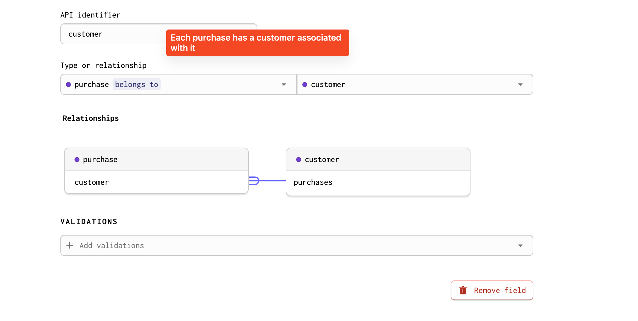
<AutoBelongsToInput /> will render it like this:
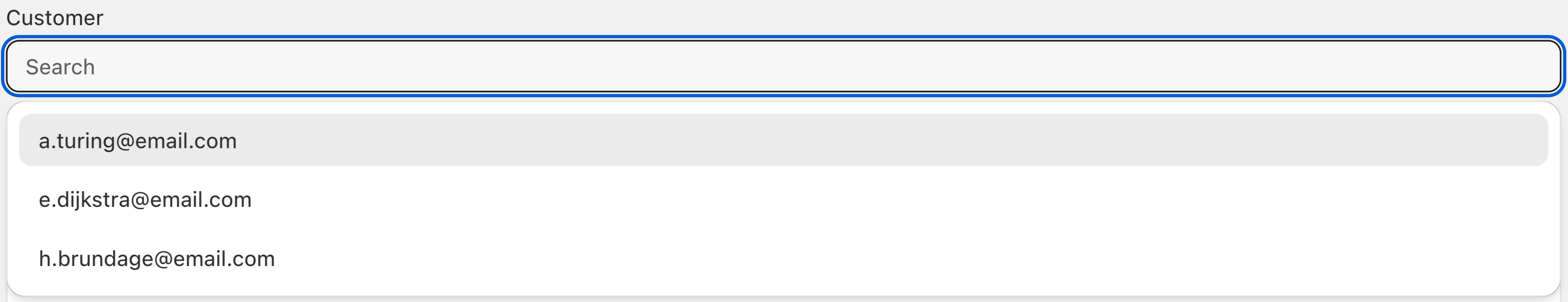
Each email is taken from a record in the customer table. The autocomponents system labelled the options with the customer's email. To render a custom label, use the optionLabel prop. This component requires the read and update permissions.
| Name | Type | Description |
|---|---|---|
field | string | Required. API identifier of the field you wish to render. The field must be of type belongs to. |
control? | Control<any> | Control object from the React Hook Form library. |
label? | ReactNode | A custom label for the input. |
placeholder? | string | Optional placeholder for the input. |
optionLabel? | OptionLabel | Type for the option label when displaying a list of records from a related model. API identifier, array of API identifiers or a callback function returning a React node. Defaults to fields named name, title, or email with a fallback to any string field and finally the id. |
recordFilter? | RecordFilter | Related record option filter. |
<AutoHasOneInput />
The <AutoHasOneInput /> component allows users to pick a single record from the related model. The relationship is defined on by the belongs to field on the child model, and the 1:1 mapping between records will be maintained.
The has one relationship will be updated by changing the ID value stored in the belongs to field on the related model. The related model will require the update permission.
| Name | Type | Description |
|---|---|---|
field | string | Required. API identifier of the field you wish to render. The field must be of type has one. |
control? | Control<any> | Control object from the React Hook Form library. |
label? | ReactNode | A custom label for the input. |
placeholder? | string | Optional placeholder for the input. |
optionLabel? | OptionLabel | Type for the option label when displaying a list of records from a related model. API identifier, array of API identifiers or a callback function returning a React node. Defaults to fields named name, title, or email with a fallback to any string field and finally the id. |
recordFilter? | RecordFilter | Related record option filter. |
Use the recordFilter prop to help avoid unlinking a relationship between already linked parent and child records.
<AutoHasManyInput />
The <AutoHasManyInput /> component allows users to pick records from the related model to associate with the current record.
A multi-select combobox is used. If AutoForm is associated the some model customer, each purchase that is selected belongs to the customer model.
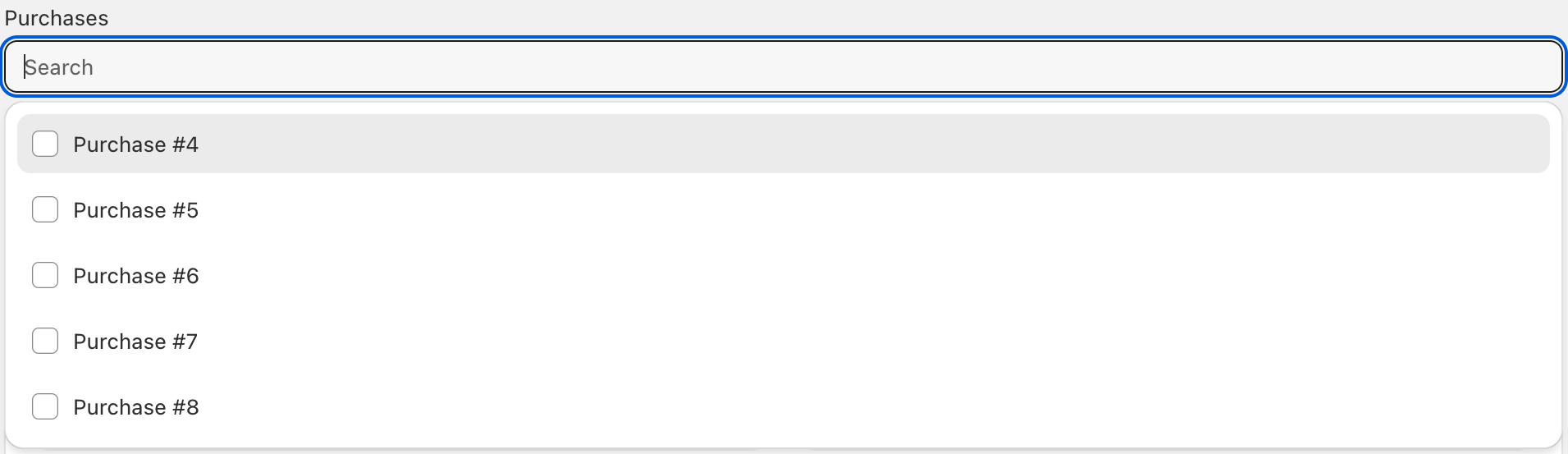
The purchase model has a belongs to relationship with the customer model. The purchase model needs the read permission to use this input.
Note that selecting a new parent for a child record will unlink the child from the previous parent. Use the recordFilter prop to help avoid unlinking a relationship between already linked parent and child records by filtering out any records with a parent relationship.
| Name | Type | Description |
|---|---|---|
field | string | Required. API identifier of the field you wish to render. The field must be of type has many. |
control? | Control<any> | Control object from the React Hook Form library. |
label? | ReactNode | A custom label for the input. |
placeholder? | string | Optional placeholder for the input. |
optionLabel? | OptionLabel | Type for the option label when displaying a list of records from a related model. API identifier, array of API identifiers or a callback function returning a React node. Defaults to fields named name, title, or email with a fallback to any string field and finally the id. |
recordFilter? | RecordFilter | Related record option filter. |
<AutoHasManyThroughInput />
The <AutoHasManyThroughInput /> component allows users to select records from the related model and make associations through creating and removing records in the join model. The join model has a belongs to field associated with the current model's has many through field, and another belongs to field associated with the related model's has many through field. A relationship between the current model and the related model is defined by the existence of a record in the join model that is associated with the corresponding current model record and related model record.
This input requires that you add a few different permissions to the access control page. The model with the hasManyThrough relationship and the join model must have all permissions enabled in order to use this input. The sibling model must have the read permission enabled.
Note that the recordFilter prop only applies to sibling model selection dropdown in the case of the has many through relationship.
| Name | Type | Description |
|---|---|---|
field | string | Required. API identifier of the field you wish to render. The field must be of type has many through. |
control? | Control<any> | Control object from the React Hook Form library. |
label? | ReactNode | A custom label for the input. |
placeholder? | string | Optional placeholder for the input. |
optionLabel? | OptionLabel | Type for the option label when displaying a list of records from a related model. API identifier, array of API identifiers or a callback function returning a React node. Defaults to fields named name, title, or email with a fallback to any string field and finally the id. |
recordFilter? | RecordFilter | Related record option filter. |
Relationship forms
Relationship forms are AutoForm input components that allow users to create, update, and delete related records through the relationship fields of an action's model.
<AutoBelongsToForm />
The <AutoBelongsToForm /> component allows users to select, create, or edit a record associated with the current record through a belongs to field.
Using a <AutoBelongsToForm/> component requires the read, create, and update permissions on related model.
| Name | Type | Description |
|---|---|---|
field | string | Required. API identifier of the field you wish to render. The field must be of type belongs to. |
children | ReactNode | Nested elements or components of the current component. |
label? | ReactNode | A custom label for the relationship form. |
recordLabel? | OptionLabel | RecordLabel | The label configuration when displaying a selected record or an option record from a related model. This can be an API identifier, array of API identifiers, or a callback function that takes the record and returns a React node. |
recordFilter? | RecordFilter | Related record option filter. |
<AutoHasOneForm />
The <AutoHasOneForm /> component allows users to create, update, or unlink a record in the related model through a has one relationship. The relationship is defined on by the belongs to field on the related child model, and the 1:1 mapping between records will be maintained.
Unlinking the related record in a has one relationship is done by updating the related record's ID value in the corresponding belongs to field to be null. To use the <AutoHasOneForm /> component, the related model must have the read, create, and update permissions.
| Name | Type | Description |
|---|---|---|
field | string | Required. API identifier of the field you wish to render. The field must be of type has one. |
children | ReactNode | Nested elements or components of the current component. |
label? | ReactNode | A custom label for the relationship form. |
recordLabel? | OptionLabel | RecordLabel | The label configuration when displaying a record from the related model. This can be an API identifier, array of API identifiers, or a callback function that takes the record and returns a React node. |
<AutoHasManyForm />
The <AutoHasManyForm /> component allows users to create, update, and delete related child records through a has many relationship field. When child records are unlinked in the <AutoHasManyForm /> component, they are deleted.
The <AutoHasManyForm /> component requires the read, create, update and delete permissions to the related model.
| Name | Type | Description |
|---|---|---|
field | string | Required. API identifier of the field you wish to render. The field must be of type has many. |
children | ReactNode | Nested elements or components of the current component. |
label? | ReactNode | A custom label for the relationship form. |
recordLabel? | OptionLabel | RecordLabel | The label configuration when displaying a records from the related model. This can be an API identifier, array of API identifiers, or a callback function that takes the record and returns a React node. |
<AutoHasManyThroughForm />
The <AutoHasManyThroughForm /> component allows users to create, update, and delete associations with the sibling model through the join model. Associations between the current model and the sibling model are defined by the two belongs to fields on the join model that point to the current model and the sibling model.
By default, AutoForm inputs within a <AutoHasManyThroughForm> will be associated with fields on the sibling model. To associate inputs with fields on the join model, wrap your AutoForm inputs with the <AutoHasManyThroughJoinModelForm /> component.
The <AutoHasManyThroughForm /> component requires the read, create, update, and delete permissions to the join model, and the read and update permissions to the sibling model.
| Name | Type | Description |
|---|---|---|
field | string | Required. API identifier of the field you wish to render. The field must be of type has many through. |
children? | ReactNode | Nested elements or components of the current component. |
label? | ReactNode | A custom label for the relationship form. |
recordLabel? | OptionLabel | RecordLabel | The option label configuration when displaying a associated records and record options from the sibling model. This can be an API identifier, array of API identifiers, or a callback function that takes the sibling model record and returns a React node. |
recordFilter? | RecordFilter | Related record option filter. This applies to the sibling model selection dropdown. |
Types
| Name | Type | Description |
|---|---|---|
OptionLabel | string | string[] | ((record: Record<string, any>) => ReactNode) | Type for the option label when displaying a list of records from a related model. API identifier, array of API identifiers or a callback function returning a React node. Defaults to fields named name, title, or email with a fallback to any string field and finally the id. |
RecordLabel | { primary?: OptionLabel; secondary?: OptionLabel; tertiary?: OptionLabel } | Type for the option label when displaying a list of records from a related model. API identifier, array of API identifiers or a callback function returning a React node. Displayed like the title of a section. |
RecordFilter | AnyFilter | AnyFilter[] | undefined | Filters that can be applied on a query to the database. |