Gadget provides high-level, super-automatic components for assembling working user interfaces very quickly called autocomponents. Autocomponents are React components that implement forms and tables that can read and write to Gadget data in your app's database. Autocomponents are available in different design systems and can be made to look and feel like the rest of your app.
When to use autocomponents
Autocomponents are intended to be high-quality interfaces for common tasks. While autocomponents offer a remarkably high degree of customizability, they are designed to help you build fast rather than build perfect. They are not intended to be a replacement for fully custom or artisanally designed user interfaces. If you need fine-grained control over your UX, Gadget recommends using the headless hooks that power autocomponents with head-ful design elements on top!
Installing autocomponents
Because autocomponents use a design system, you need to install the design system's dependencies to use them.
Currently, Gadget supports the following design systems:
Autocomponents are only available in @gadgetinc/react version 0.16.0 and later. To upgrade to the latest version, run the following in
the Gadget command palette:
Upgrade @gadgetinc/react to >0.16.0
yarn add @gadgetinc/react
<AutoForm />
<AutoForm /> renders a form that calls one of your app's backend API actions. On form submit, <AutoForm /> can call one of your model actions such as create, update, or a custom action. Global actions can also be run by <AutoForm />.
<AutoForm /> renders the correct HTML input element for each backend field and includes support for form validation, relationship fields, error handling, autocomplete, and file uploads.
For example, if you have a backend widget model with a name and inventoryCount field, you can render a form to create a new widget like so:
web/components/example.jsx
React
import { api } from "../api";
export default function Example() {
return <AutoForm action={api.widget.create} />;
}
import { api } from "../api";
export default function Example() {
return <AutoForm action={api.widget.create} />;
}
AutoForm components can also be given an explicit set of children which lets you re-order, wrap, and replace child fields as needed:
web/components/example.jsx
React
import { api } from "../api";
export default function Example() {
return (
<AutoForm action={api.widget.create}>
<div style={{ display: "flex", flexDirection: "row", gap: "1rem" }}>
{/** put these two auto inputs in a wrapper component to align them horizontally */}
<AutoInput field="name" />
<AutoInput field="inventoryCount" />
</div>
{/** render a submit button */}
<AutoSubmit />
</AutoForm>
);
}
Using <AutoForm /> without specifying the included fields or explicitly passing children will render
a form with all fields from the model or all params for an action. This means that adding a new field to a model or params to a global
action will also add an input for that field to the form.
Make sure you test any default <AutoForm /> components after making changes to your models or actions to ensure they still work as
expected.
Choosing fields for the form
By default, <AutoForm /> will render input components to set or edit data for each field on a model record, or each global action parameter. Form inputs can be removed, re-ordered, or grouped.
To include only some of the fields of a model or action in your form, pass the include option with a list of fields to render:
You cannot have include and exclude defined for the same form.
<AutoForm /> does not currently support custom params with the object or array types.
AutoForm rich text fields
The auto-generated input for rich text fields in AutoForms require an extra dependency to be installed:
install the rich text editor dependency
yarn add -D @mdxeditor/editor
Then import the stylesheet into your app:
web/components/App.jsx
React
import "@mdxeditor/editor/style.css";
import "@mdxeditor/editor/style.css";
Custom form components
<AutoForm /> can be passed an explicit set of children components or HTML elements to render instead of the default auto-generated components. This allows full control of field order and layout, and provides the ability to mix and match autocomponents with custom inputs.
To begin customizing the children, open the <AutoForm /> tag and pass the children components or HTML elements you'd like to render, like so:
add custom components or HTML elements to an AutoForm
React
<AutoForm action={api.widget.create}>
<h1>My form title</h1>
{/* more form elements*/}
</AutoForm>
<AutoForm action={api.widget.create}>
<h1>My form title</h1>
{/* more form elements*/}
</AutoForm>
To keep your form looking like the fully-automatic version of an <AutoForm/>, replace each field with an <AutoInput field="..."/> element and add an <AutoSubmit/> element:
render only the name and inventoryCount fields with AutoInput children
<AutoForm /> has a title prop that can be used to override the default form title. This is useful when you want a custom form title but want to use the auto-generated input components for a form:
<AutoInput /> renders an automatic input for the provided field, selecting the right kind of control, formatting, and experience for inputting data for a given field type.
<AutoForm/>'s automatic input selection uses <AutoInput/> under the hood, so if you want to take over and customize the layout of your form while using the same input components, you can keep using a fully automatic version of each field with <AutoInput/>.
For example, you can convert the form from the previous section to use explicit children like so:
AutoForm vs manually built AutoForm using AutoInput and AutoSubmit
The field prop for each <AutoInput/> specifies the model field to accept input for. You can also add HTML elements or layout components to augment the form layout:
render an AutoForm using a HTML elements to augment the form layout
If you would like to have more control over the input's appearance, you can use the individual input types directly:
manually select the input component that is used
React
// before
() => (
<AutoForm action={api.widget.create}>
<AutoInput field="name" />
<AutoInput field="inventoryCount" />
<AutoSubmit />
</AutoForm>
);
// after
() => (
<AutoForm action={api.widget.create}>
{/* Field specific input components can take in additional props that are not available in the general AutoInput component */}
<AutoStringInput field="name" />
<AutoNumberInput field="inventoryCount" />
<AutoSubmit />
</AutoForm>
);
An existing record can be automatically fetched by passing the record id into the findBy prop. You need to make sure your current user role has read access to the model you are trying to fetch.
When using a findBy for a field other than id, it requires a by-field record finder like .findBySlug to exist for your model, which is
generated by adding a uniqueness validation to a field.
Call custom model actions on submit
<AutoForm /> can also be used to call custom model actions. Appropriate input components will be rendered for any custom params defined for the action. These custom actions require a record to be passed in, so you must pass the findBy prop to fetch the record to run the action on.
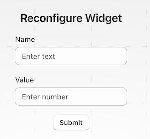
For example, if you have a custom widget.reconfigure action that has state: string and value: number params defined, the default <AutoForm> will render with a text input for name and a number input for value.
To fetch an existing record by something other than id, pass the findBy prop a set of conditions to find by:
render a form that runs a custom action for widget record with name="foobar"
<AutoForm /> can also be used to call global actions. Appropriate input components will be rendered for any custom params defined for the action.
example of a global action called on form submit
React
<AutoForm action={api.sendEmail} />
<AutoForm action={api.sendEmail} />
Setting initial values for create forms
Forms for create actions will automatically populate with default values set for fields in your backend Gadget models.
For example, if you have set the default inventoryCount for the widget model to 0 in the model schema page, the form will start with the inventoryCount field set to 0.
If you'd like to pre-populate the form with specific values when creating new records, you can also pass the defaultValues prop to set explicit initial values for the form:
defaultValues must be passed in the fully-qualified form that includes the model name, like widget.name, instead of just name. This wrapper object allows the form to store other state beyond just the model data, and matches your app's API format under the hood.
Validation is automatically applied to all <AutoForm/> inputs. The default validation rules are set using the field validation rules set on a model's schema.
Validating custom params
For custom parameters on model or global actions, you can manually validate params passed into the action from an <AutoForm />. If a value is invalid, you can return an InvalidRecordError with a message to display to the user.
This validation is done in your actions, not in the frontend.
Here's a sample action that validates a custom params object:
validate custom params on a global action
JavaScript
// import InvalidRecordError from gadget-server
import { InvalidRecordError } from "gadget-server";
export const run: ActionRun = async ({ params, logger, api, connections }) => {
// validate the param manually
if (params.count < 0 || params.count > 100) {
throw new InvalidRecordError("count param not valid", [
{ apiIdentifier: "customUpload", message: "count must be between 0 and 100" },
]);
}
// ... custom action code
};
export const params = {
count: { type: "number" },
};
You can call this action from an <AutoForm /> and the validation error will be displayed:
calling the action with custom params
React
<AutoForm action={api.customAction} />
<AutoForm action={api.customAction} />
To learn about setting validations on fields, see the field validation guide.
<AutoForm /> does not support custom client-side validation.
Manual form control using react-hook-form
If you need to manually control the form state, you can use the react-hook-form hooks directly. This is useful if you need to integrate with form state that is not provided by <AutoForm />, or if you need to manually control the form state for some other reason.
For example, to clear the values inside an input, the useFormContext hook from react-hook-form to access the setValue function and set the value of the name field to an empty string:
React
import { api } from "../api";
// import useFormContext to get access to react-hook-form API
import { useFormContext } from "react-hook-form";
export default function () {
return (
<AutoForm action={api.widget.create}>
<div style={{ display: "flex", flexDirection: "row", gap: "1rem" }}>
<AutoInput field="name" />
<ClearButton />
</div>
<AutoSubmit />
</AutoForm>
);
}
// custom component that selects a product using an external resource picker
const ClearButton = () => {
// use setValue to manually manage form state for the selected product
const { setValue } = useFormContext();
return (
<button
onClick={() => {
// Clearing the value of the name field
setValue("widget.name", "");
}}
>
Clear
</button>
);
};
Running code after form submission
The <AutoForm> also has an onSuccess callback hook that allows you to run code after the form has been successfully submitted. This can be useful for things like redirecting the user to a new page, showing a success message, or updating the UI in some way.
<AutoButton /> renders a button that when clicked calls one of your app's backend API actions with variables passed as a prop. You can use <AutoButton /> for model actions to create, update, or delete records, or to call a global action.
<AutoButton /> renders a button from the design system you're using, so it fits right in with the rest of your application and doesn't require any additional styling.
To render an <AutoButton/>, pass the action prop with the backend API action you want to call.
render a button that when clicked calls the create action
React
<AutoButton action={api.widget.create} />
// when clicked, will run api.widget.create()
<AutoButton action={api.widget.create} />
// when clicked, will run api.widget.create()
When clicked, this button will run the action, and show a success or error toast when it completes. It will also show a nice loading spinner while the action is running.
Often, you'll need to pass variables to your action. Pass them in the same style as you would pass them to your app's JS client:
render a button that when clicked calls the create action
React
<AutoButton action={api.widget.create} variables={{ name: "foobar", inventoryCount: 0 }} />
// when clicked, will run api.widget.create({ name: "foobar", inventoryCount: 0 })
<AutoButton action={api.widget.create} variables={{ name: "foobar", inventoryCount: 0 }} />
// when clicked, will run api.widget.create({ name: "foobar", inventoryCount: 0 })
Variables can be set dynamically using the normal React state management tools, like a useState hook:
render a button that when clicked calls the create action with settable variables
<AutoButton/> accepts all the props from the design system you're using, so you can control its look and feel in the same way you would control the <Button/> component from the underlying design system.
For example, to set a Polaris <AutoButton>'s label, you can pass label as children:
<AutoButton/> has onSuccess and onError callback props that are triggered when the action succeeds or fails. This can be useful for things like redirecting the user to a new page, showing a success message, or updating the UI in some way.
For example, you can run code after a button is clicked like so:
run code after successful action
React
() => (
<AutoButton
action={api.widget.create}
onSuccess={(result) => {
const { data } = result;
// onSuccess is passed the same object that calling an action
// with `useAction` would return, a `{data, fetching, error}` object
console.log("created record:", data.inventoryCount);
// navigate to the new record
navigate(`/widgets/${data.id}`);
}}
/>
);
You can also pass custom error handlers with onError, which will be passed an Error object describing the error:
When onSuccess or onError is passed, the default behavior of rendering a toast in the selected design system is overridden. If you want to maintain that behavior, you need to trigger it yourself.
For example, if you want to show a Shopify Polaris toast after the button is clicked, you can call the toast function:
React
// Show a toast after the button is clicked
() => (
<AutoButton
action={api.widget.create}
onSuccess={() => {
shopify.toast.show(`New widget created.`);
}}
/>
);
// Show a toast after the button is clicked
() => (
<AutoButton
action={api.widget.create}
onSuccess={() => {
shopify.toast.show(`New widget created.`);
}}
/>
);
<AutoTable />
<AutoTable /> components generate data tables for your React frontends and are pre-configured to read and display data from your data models.
<AutoTable /> reads each record, and renders the right kind of cell. This autocomponent supports pagination, filtering, searching, and sorting out of the box.
simple AutoTable example: build a data table for a customer model
React
// your app's auto-generated API client
import { api } from "../api";
export const CustomersTable = () => {
return <AutoTable model={api.customer} />;
};
// your app's auto-generated API client
import { api } from "../api";
export const CustomersTable = () => {
return <AutoTable model={api.customer} />;
};
Using <AutoTable /> without specifying the included columns will render a table with all fields from the
model. This means that adding a new field to a model will also add a column to the table.
Make sure that you test any default <AutoTable /> components after making changes to your models to ensure they still work as expected.
Filter, sort, and search
AutoTable uses the useFindMany hook to fetch data from the backend under the hood, so AutoTable has the same filter prop as useFindMany. The sort prop from useFindMany is also available, but has been renamed to initialSort since users could choose a different column to sort by after the table is rendered.
AutoTable provides a search bar that filters records based on the query. It uses the same full-text search feature found in the API client. It is enabled by default, but can be disabled by passing searchable={false} to the AutoTable component.
React
// to disable the search bar
export const WidgetTable = () => {
return <AutoTable model={api.widget} searchable={false} />;
};
// to disable the search bar
export const WidgetTable = () => {
return <AutoTable model={api.widget} searchable={false} />;
};
To programmatically control the search value from outside of the AutoTable component, you can use the searchValue prop.
AutoTable supports params from the underlying components in the design system you're using, so you can control its look and feel in the same way you would when building with the system's native table component.
You can specify which columns to display. Pass an array of their API identifiers to the columns prop. The columns are displayed in the order in which they are listed.
include columns
React
import { api } from "../api";
export const CustomColumnsTable = () => {
// Renders a table with "First Name", "Last Name", and "Email" as the only columns
return <AutoTable model={api.customer} columns={["firstName", "lastName", "email"]} />;
};
import { api } from "../api";
export const CustomColumnsTable = () => {
// Renders a table with "First Name", "Last Name", and "Email" as the only columns
return <AutoTable model={api.customer} columns={["firstName", "lastName", "email"]} />;
};
Exclude columns from the table like so:
exclude columns
React
import { api } from "../api";
export const ExcludeColumnsTable = () => {
// Renders all customer fields except "First Name", "Last Name", and "Email"
return <AutoTable model={api.customer} excludeColumns={["firstName", "lastName", "email"]} />;
};
import { api } from "../api";
export const ExcludeColumnsTable = () => {
// Renders all customer fields except "First Name", "Last Name", and "Email"
return <AutoTable model={api.customer} excludeColumns={["firstName", "lastName", "email"]} />;
};
Render related fields
Related fields (fields that are of type has one, belongs to, or has many) are not rendered by default. You can render them using dot notation in the columns prop, using the same syntax as your app's GraphQL queries.
For has one or belongs to relationships, you can directly access fields on the related model:
show email of the customer that the purchase belongs to
React
import { api } from "../api";
export const CourseTable = () => {
return (
<AutoTable
model={api.course}
columns={[
"id",
"subject",
"teacher.email", // for "has one" or "belongs to" relationships
]}
/>
);
};
import { api } from "../api";
export const CourseTable = () => {
return (
<AutoTable
model={api.course}
columns={[
"id",
"subject",
"teacher.email", // for "has one" or "belongs to" relationships
]}
/>
);
};
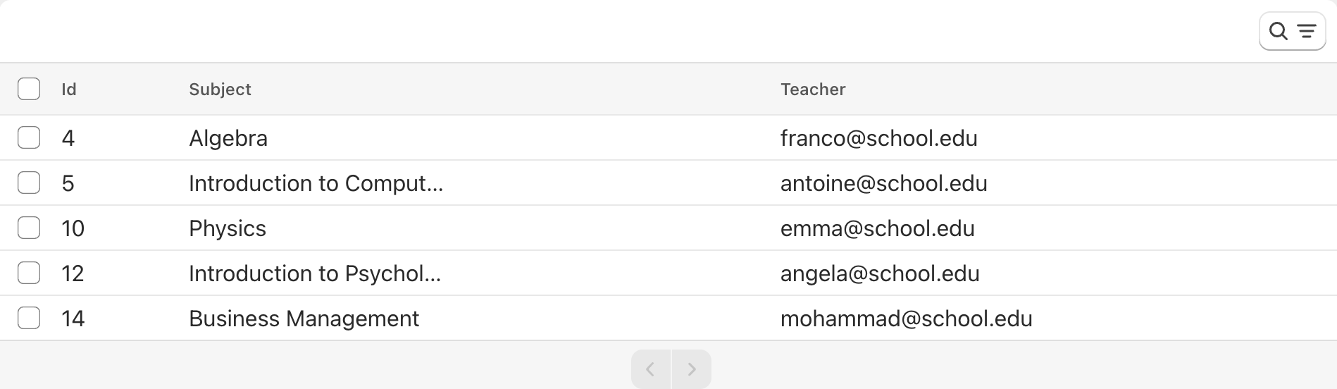
CourseTable using the Polaris design system renders like so:
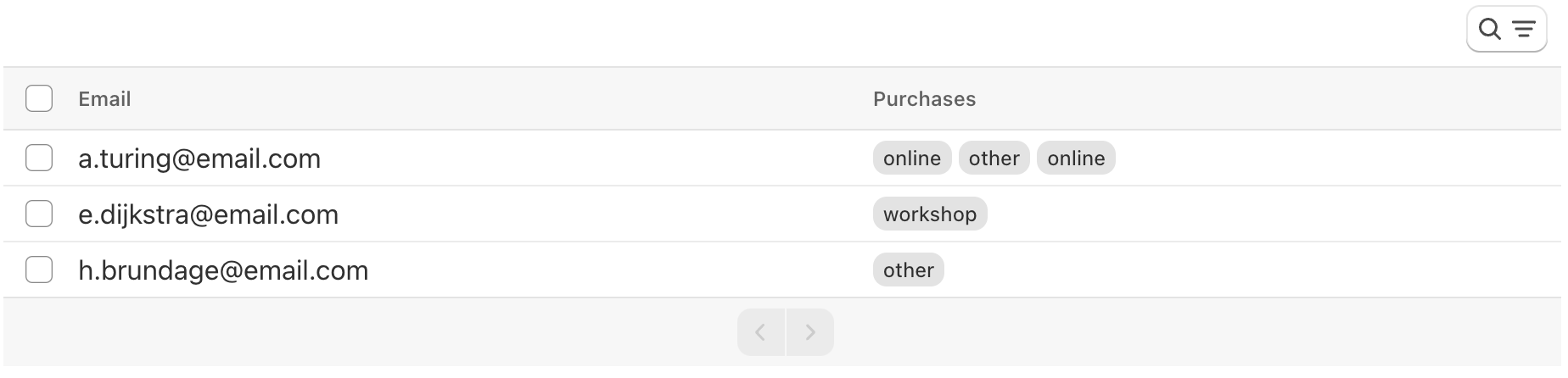
For example, CustomerTable displays the records associated with the customer model. Each customerhas manypurchases. Because GraphQL query syntax is used, edges.node goes between the related model name and the field name, like so: purchases.edges.node.purchaseLocation.
show all purchase locations associated with each customer
React
import { api } from "../api";
export const CustomerTable = () => {
return (
<AutoTable
model={api.customer}
columns={[
"email",
"purchases.edges.node.purchaseLocation", // for "has many" relationships
]}
/>
);
};
import { api } from "../api";
export const CustomerTable = () => {
return (
<AutoTable
model={api.customer}
columns={[
"email",
"purchases.edges.node.purchaseLocation", // for "has many" relationships
]}
/>
);
};
CustomerTable renders like so:
Render a custom cell
If you would like to change the way a field is being rendered or add a new column to your table, you can an object to the columns prop:
example of a custom cell renderer in an AutoTable
React
export const CustomTable = () => {
// Renders a table with a custom column "Customer name", and the email column
return (
<AutoTable
model={api.customer}
columns={[
{
header: "Customer name",
render: ({ record }) => {
// Displays the name like so: A. Turing
return <div>{record.firstName[0].toUpperCase + ". " + record.lastName}</div>;
},
},
"email",
]}
/>
);
};
Manually set sortable columns
By default, columns for field types that are able to be sorted alphanumerically will be sortable in an AutoTable. A list of sortable fields can be found in your API documentation.
If you want to manually set columns that are sortable in an AutoTable you can use the sortable boolean in a custom column configuration:
specify certain columns as sortable
React
import { api } from "../api";
export const RecentTable = () => {
return (
<AutoTable
model={api.widget}
columns={[
// name will not be a sortable column
{ field: "name", sortable: false },
// type will be sortable
{ field: "type", sortable: true },
// code will be sortable if the field type is sortable
"code",
]}
/>
);
};
Realtime query support for <AutoTable />
By default, an AutoTable does not re-render when a record is created/updated/deleted on the backend.
If you want to keep your frontend data table up to date with the data in your database, AutoTable components support realtime queries. Anytime a record is updated in the model powering the AutoTable, the AutoTable will automatically re-render to reflect the changes.
You can enable realtime query support on your AutoTable with the live prop:
React
// This component will rerender every time a customer is added, removed or updated
<AutoTable model={api.customer} live />
// This component will rerender every time a customer is added, removed or updated
<AutoTable model={api.customer} live />
Custom onClick
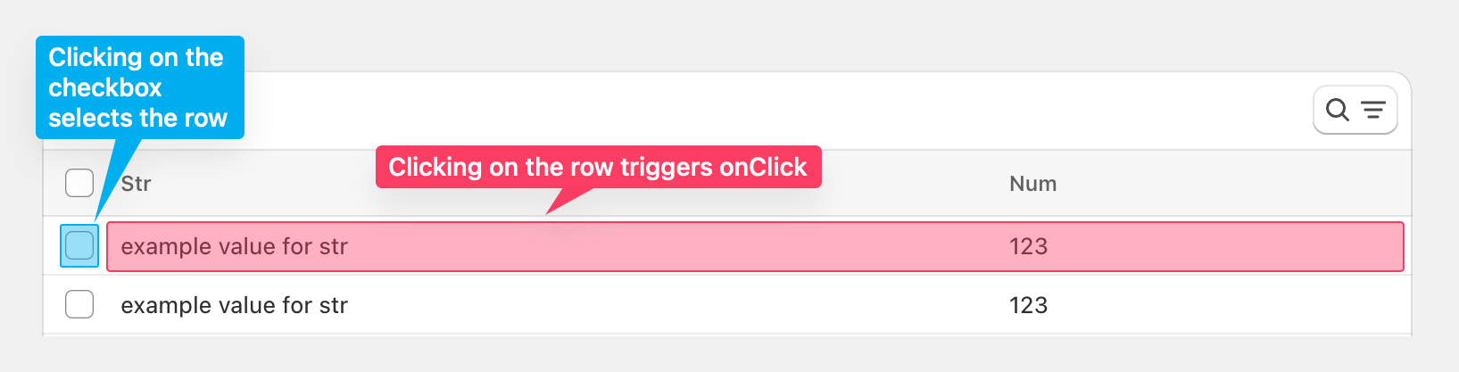
The onClick prop is a callback that is fired when the row is clicked. Including onClick overrides the default click behavior, which is to select the row.
Note that even when onClick is included as a prop, rows can still be selected by pressing directly on the checkbox:
The row parameter is an object that describes a row the user selected. Say I have a row with columns "First name", "Last name" and "Email", (row) => console.log(row) prints this object to the console:
json
{
"id": "147",
"firstName": "example value for firstName",
"lastName": "example value for lastName",
"email": "[email protected]"
}
Bulk selection
You can trigger bulk actions from AutoTable out of the box. Upon selecting a row, a bulk action can be run by selecting the three dots, then selecting the name of the bulk action. The action is run for each selected record in the table.
Users can trigger actions that have delete and customaction types. AutoTable cannot trigger create and update action types. Instead, use AutoForm to create or update a record.
By default, all delete and custom actions are included in the table. You can include actions by passing their action API identifiers:
React
// myCustomAction is the API identifier of the action
<AutoTable actions={["myCustomAction"]} />
// myCustomAction is the API identifier of the action
<AutoTable actions={["myCustomAction"]} />
Actions can also be excluded:
React
// myOtherCustomAction is the API identifier of the action
<AutoTable excludeActions={["myOtherCustomAction"]} />
// myOtherCustomAction is the API identifier of the action
<AutoTable excludeActions={["myOtherCustomAction"]} />
When a user selects an action, the run() method of the action is called, and each row is passed in as a record.
Custom bulk action
The actions prop allows for a custom callback or renderer. A bulk action cannot have both a custom callback and renderer.
Custom callback
By default, when a user clicks on an action, a confirmation window appears. To override this behavior, use a custom callback.
To describe your custom callback, include an object in the actions prop:
action with a custom callback
React
<AutoTable
actions={[
{
// Name of the custom action
label: "Custom action name",
// Prints the list of records that were selected to the console
action: (records) => {
console.log("records: ", records);
},
},
]}
/>
<AutoTable
actions={[
{
// Name of the custom action
label: "Custom action name",
// Prints the list of records that were selected to the console
action: (records) => {
console.log("records: ", records);
},
},
]}
/>
You can then use your api client to run an action on the selected records:
run a global action on the selected records
React
<AutoTable
actions={[
{
label: "Export",
action: async (records) => {
// call the exportData global action, passing the selected records
await api.exportData({ records });
},
},
]}
/>
<AutoTable
actions={[
{
label: "Export",
action: async (records) => {
// call the exportData global action, passing the selected records
await api.exportData({ records });
},
},
]}
/>
Supported design systems
If you'd like to have more information for specific design systems, check out the following guides: